Our Sea Point project is presented as a luxury beachfront apartment, carefully designed to meet the needs and desires of its owners. Every detail, from the design of its floor plan to the furniture, has been designed to transcend simple visual appearance, trying to awaken emotions and create a deep connection with those who inhabit it. This project thus becomes one of the most important of Piekno Studio, as it fully represents our values.
The welcome
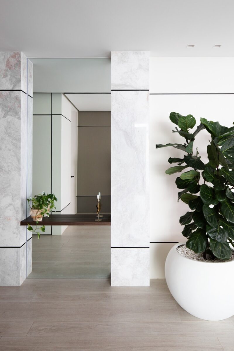
In this article, we will focus on analyzing in detail the living room and dining room area, as the backbone space of the public areas of the project. Upon entering the apartment, we are greeted by an entrance with walls covered in marble that frame a mirror with indirect lighting that provides spaciousness and reveals the contemporary nature of the main room.

Photographs by Karen Moreno
Pictorial modulation
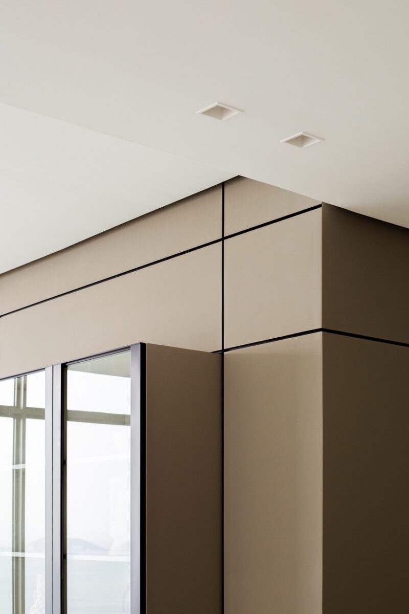
If there is something that characterizes the design of this apartment, it is the modulation of all the elements that make up each space: walls, floors, ceilings, lighting, custom furniture. Each wall is conceived as a blank canvas reminiscent of a Mondrian painting, bringing that linearity to the three dimensions of the space.
Visual harmony for a sophisticated experience
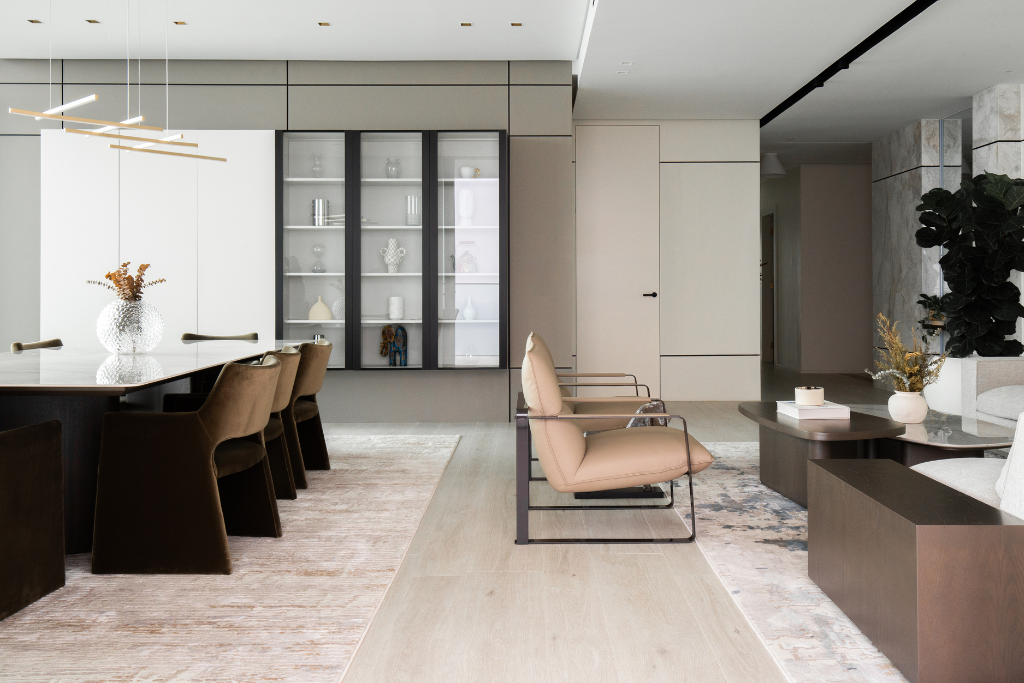
Following the firm’s philosophy, we apply the concept “less is more” in the conception of the living room, avoiding filling the space with multiple decorative elements and seeking to prioritize a meticulous selection of harmonious pieces that provide visual harmony. In this way, each chosen object stands out on its own, creating a calm and sophisticated experience.
In this project, lighting plays a fundamental role in creating different environments. The combination of ceiling lamps, spot lights and tracks adapts to the different activities carried out in the home. It is precisely these rails that, together with the air conditioning diffusers, emphasize the linearity of the composition in the horizontal planes.
In front of the dining room, we find a custom-designed floating piece of furniture perfectly modulated and coordinated with the divisions of the wall paneling that supports it. Six modules of the same size: three opaque in white and three in glass with black profiles, like a display case.

Photographs by Karen Moreno
A calm atmosphere
A palette of neutral tones that contrasts lighter colors with black or dark brown, and a mix of textures from materials such as wood, marble and furniture textiles provide us with a harmonious atmosphere that emanates peace.
A space in which the shared experiences of its users develop, with the sea as the horizon and main protagonist, inviting us to contemplate it in calm.

Architect / Engineer / Artist
CEO of PIEKNO Studio. Anna holds a Master of Engineering Science in Architecture, which she earned in 2009, following a proud family legacy of three generations of engineers. Her love for art has significantly influenced her journey as a designer, architect, engineer, and woman entrepreneur.


